UX Design Case Study: Good Taste
About this project
What started as a delightful dilemma has ended up becoming the stuff of nightmares for many. Meme pages are filled with references to the problem, Reddit threads have formed up in commiseration as many wonder: why is it so difficult to just agree on a restaurant?
Good Taste is a dining and food community app that aims to solve just this problem, so that dining out can be the seamless and relaxing experience you meant it to be.
My role: Entire design process from research and conception, to conception, visualization and testing
01
The problem
This all started off with a single, commonly asked question: where should we eat?
Living in New York City and other urban areas brings about the mother of all first-world problems: being spoilt for choice. With food, especially, we see this problem time and again: a mountain of options, accompanied by another mountain of food blogs and Yelp reviews sporting suspiciously similar language. What can start off as a simple, well-intentioned excursion to enjoy a girls’ night out or a team bonding dinner can set off a black hole of Googling and hair-pulling.
02
User research
This frustration was only the tip of the iceberg. The next step was to start researching to identify the friction and thought processes behind people’s decision making when selecting restaurants to eat at.
Given the nature of the issue, the target audience was people between the ages of 18 to 40, with above average income, the willingness to spend on dining out, a similar willingness to try new food, and who live in or regularly visit urban areas.
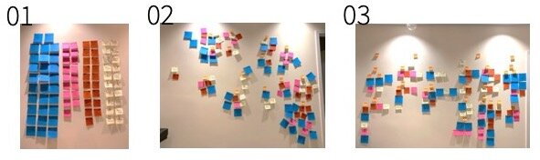
Affinity mapping the results of four user interviews.
The sentiments expressed in the user interviews could be distilled into four areas:
01
What users wanted to achieve
To make a satisfactory decision for their own and their companions’ criteria
To sort through available information
To optimise benefit to exertion
02
What led to these objectives
A (very understandable) desire for good food
A desire to find social locations appropriate to the formality, size and atmosphere of the event
A need for convenience (e.g. time, distance)
03
How they made their selections
The decision would always be between re-visiting a regular spot or trying a new place
The major frustration was in trying to find common ground with friends, especially if constraints are not clearly articulated
There was a high skepticism of review sites due to sponsored reviews and advertisements
04
What their ideal would look like
Users preferred shortened lists of options to prevent decision fatigue
Users wanted more transparency in the provenance of reviews and reviewers
Users wanted a more aggregated source of word of mouth recommendations, which they found more reliable
03
User persona
With these motivations, needs and wants in mind, I created two user personas to further refine and target the design process.
To sum up the research and personas, the problem boiled down to folks like Maya and Jacob needing a way to find and decide on places to eat because of an overwhelming number of options and questionable reliability of information sources.
Meet Maya.


Meet Jacob.


04
Land-scape analysis
The next step was to see what people were currently using to solve their problems - which aspects could be used as springboards and inspiration, or which could be watch-outs.
Direct competitors include information sources that tell users where to dine: lifestyle blogs, review/reservation sites, lifestyle magazines, guides or tv shows and delivery sites.
Indirect competitors include features that could overlap with information discovery: viral news outlets, grocery delivery, search engines, social media, and other recommendation sites.

Comparison of six direct and indirect competitors offering different methods of restaurant discovery.
Direct
Direct competitors analysed included Yelp and Eater. The former represented the most immediate and first go-to source of information, used widely due to its prevalence as a business directory. However, it was also associated with less discerning reviews and more casual meals. The latter represented restaurant guide sites known for listicles and detailed reviews, however it was associated more with fine dining options and only operated out of select cities.
Indirect
Indirect competitors included MealPal, a lunch subscription service which users enjoyed for its good value and recommendations near work, as well as social sites like Instagram for comments/ word of mouth recommendations and photos accompanied by location tags. These indirect competitors included relevant features, but required much more sifting to get true recommendations.

From the feature comparison above, Yelp is the closest competitor, with the most features. However, certain logistical functions (e.g. budget filter, mapping feature) will be the bedrock of expected features, while ancillary ones added over time (e.g. reservations, takeout) were deemed less important.

In the above competitive map, we can see that as the direct competitors seem clustered around the individual experience extreme and lack full customisation, there may be an opportunity to incorporate more social aspects and customisation into restaurant recommendations.
It became clear that while existing solutions offered a wide range of information, the dining-specific players tended to focus on breadth and a one-size-fits-all experience, while consumers who were willing to put in more effort sifting through information using indirect competitors were rewarded with more personalised recommendations that often came from their social circles. The area that I wanted to focus my MVP on was therefore on the top right of this map, focused on dining recommendations that offered both a more custom and social experience.
05
Content, features
Taking the above into account, I wanted to introduce Good Taste: a restaurant exploration platform offering custom and reliable recommendations for users and their friends. The idea is a one-stop, socially seamless and curated destination: users would be able to find both old and new dining recommendations tailored to their own and their group’s requirements.
Main user flow
Say that Maya’s issue was finding common ground when arranging meals with her friends. So instead, she uses the app to create an event, invites her friends and the app will pull from their saved history and preferences to recommend the top 5 options that fits the group’s criteria. They can add filters, vote and comment on preferences directly and then pick the top option from there.

This would simplify the process from the old (left) to new (right) user flows below:

The very extensive old user flow.
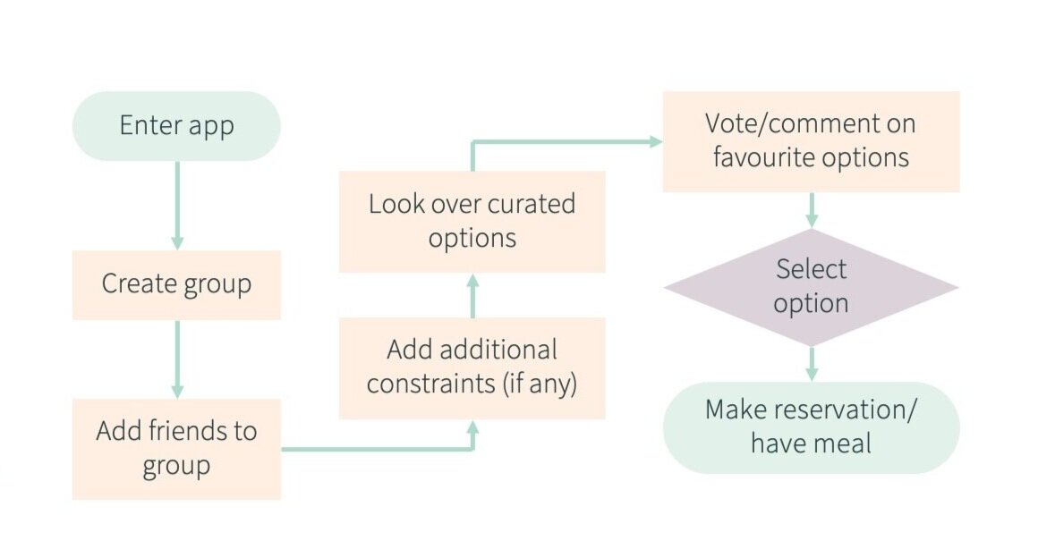
The streamlined new user flow.
Features
I first ideated to come up with ways to address the various grievances and nice-to-haves I’d observed. The custom mapping feature, for example, was inspired by shared music playlists - a food playlist, for word of mouth recommendations from friends. Not only would these speak to different occasions, moods and address the reliability aspect (i.e. by following friends or others with similar taste in restaurants), they would also be up to date with the map-maker’s preferences vs. static listicles.
I then utilised two feature prioritisation matrices to map their importance. Logistical features such as filters, payment methods and maps are more expected by users and essential to decision making. Other features I’d come up with like having secret locations (e.g. supper clubs), or expert interviews by chefs played up the exclusivity and novelty angles, but were also higher expense and less essential.

Above: Effort x Essential matrix

Above: Impact x Expectation matrix
I then narrowed down the features I would include in the MVP into five categories: (1) Filters & tags, (2) Logistics & details, (3) Recommendations, (4) Social, (5) Mapping (for a full list, refer to the full deck below).
Site map
I then organised the features according to user flow and key pages/screens. Card sorting helped me determine what was top of mind for users during their selection process.

The initial version of the site map.
06
Wire-framing
Next, I began my wireframing process to initiate mocking up what each screen would contain and the hierarchy of the information. I played around with multiple iterations of the wireframes, going from hand-drawn sketches to different versions of each digital wireframe on Sketch.
My focus was on both the overall flow - whether and how users could accomplish their objective in each use case - as well as beginning to examine the more granular aspects - how much information to offer, how to organise it, where to locate each button and so on.
To see the rest of the wireframes, refer to the full deck.
Home screen

Events screen

07
Usability testing
After turning my wireframes into my MVP, I drew up three scenarios to use in conducting usability testing, along with the path I expected users to take:
01
Searching for restaurants on your own
Prioritising convenience, distance and other logistical factors

02
Looking for restaurants for a group
Prioritising budget, dietary restrictions and for varied levels of familiarity

03
Searching for future reference
E.g. drawing up a local list to bring friends and families to when they visit

Right off the bat, I realised a few main issues with my current setup. A few functions needed to be highlighted more clearly as ways to search as well before people would think to use them. The other, broader issue in the back of my mind centred on cohesion. I’d added features that spoke to the social element of the app, but the different pieces still felt a little disjointed. The app needed a more clear-cut identity to elevate it from being the sum of its parts - i.e. largely functional - to something that would integrate into users’ lifestyles and have them coming back.
These two concerns were invariably linked as well. If users saw the app purely as a search function (albeit with improved recommendations), there would be no impetus for them to change their behaviour; with no change in behaviour, there would be very little to differentiate Good Taste from existing players.

Identified issues from testing and ways to address them

After much head scratching, I decided that I needed more of a focal point for the app: it would not only offer restaurant search functionality with some social elements, but it would be a food community. To account for this, I adjusted my site map and pages to emphasise more social elements and highlight key features.
This angle would be the string that could tie events, P2P recommendations, maps and reviewing together; it would offer the option to build your foodie reputation, become a source of truth for all things dining related and offer options to step outside your comfort zone - in a safe space. Bon Appetit, meets FB Events, meets Groups, meets GMaps and Spotify. A lot of meeting, but that’s exactly the point of a community.
The final prototype:
What better way to understand the idea than to try it out yourself, and to share your Good Taste with your friends? Click around on the Invision prototype below:
The full deck
Return to top